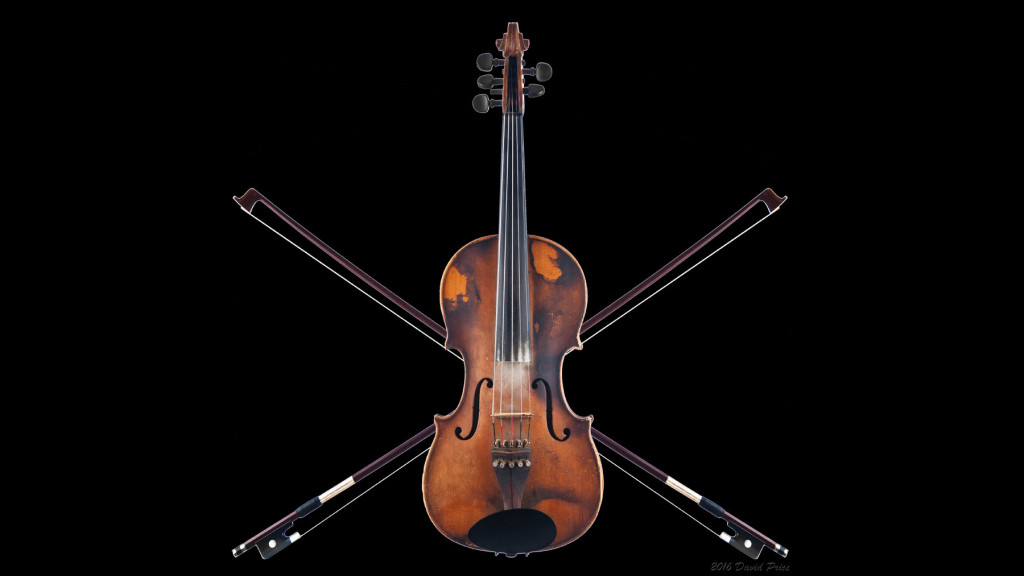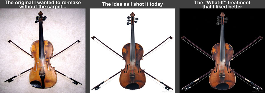
Years ago, some friends and I were messing around, experimenting if you will, with some concept photographic sketches and some writing. We got onto the idea of an extended piratical adventure and ran with it. It was all in fun; purely expressions of art, and the art of the written word, for our own humor and amusement. For my part, I made a pirate flag out of a violin and two crossed bows. I put them on the ground just so, stood over it, and pressed the button. Bam. Done. We had a laugh over the idea, and moved on.
Fast-forward a few years. I took part in Don Giannatti’s Project 52. Then I came across this old picture, and I wondered, “What would it look like if I knew then what I think I know now…?”
So, I re-made the shot, and I’m really glad I did. Let me walk you through my process on this shot…after the jump.

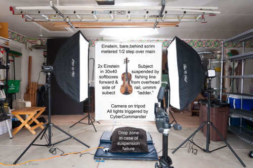
Sometimes when I shoot, I work from the subject first and then set the background to it. More often than not, though, I work from the background to the front. While thinking through this project, I started setting this up with the idea of shooting this on a white background, so that I could remove the subject off the background and into a composite afterwards. I have a 5’x6’ piece of rip-stop nylon that I use as a diffusion scrim sometimes. You can use a white, fabric shower curtain for this, too, but today I used the nylon. I mounted it on a Do-It-Yourself PVC frame attached to a couple of light stands. I put a bare light, in this case an Einstein 640 behind the scrim at the same height the subject was going to be, and measured the power to be one stop over what the main light would be, in this case f/11. I knew I was going to be shooting at f/8 for the instrument itself.
Heh, I can hear Don even now: “…After all, the correct exposure of white is white…”
I strung up the subject (yeah, that’s an interesting sentence to write…) so that it would be in one, stationary place, then set up the tripod and camera. I also made certain there was padding on the floor, on the chance that the violin fell. It’s not likely, but better safe than feeling stupid. I squared up the camera and framing, then set about lighting it from the sides.
A couple of things I learned through Project 52: Set your focus point, then turn off auto-focus so the camera isn’t hunting in the dark if you turn off the other lights. Also, since you’re on a tripod, you can also turn off the vibration reduction aspect on your camera / lens.
I placed two matching lights on either side of the subject in 30×40” softboxes, just camera front of the subject. Using a light meter, I measured the power so that the total between the lights came out to f/8. Then I made the shots. Using the same technique, I replaced the violin with a bow and made those shots, then took it into post-production.

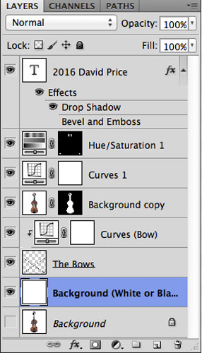
As you can see in the layers screen shot, I’m pretty much working from back to front here as well. I began by opening the shot of the violin as my base shot. Almost immediately, I added a layer which would become my background color (white to start), and placed the bows on a layer right above that. Since the camera did not change position, and the subjects were in the same location, I knew the scale of the bows would be correct to the instrument in the photos. I added a Curves layer to increase the contrast a little before moving on.
I copied the violin to a new layer (⌘-J on my Mac) and used the wand tool to select the white for masking, allowing the bows to show through. A little bit of fidgeting to get the placement of the bows just so, and I was done, or so I thought.
It took me a few minutes (okay, an hour) to realize that I had a lovely idea on white. Then I remembered that most pirate flags are on a black field. Fortunately for me, because I had taken the time to prepare the pieces and parts without blowing out the background and flaring into the lens, all I had to do, really, was change my created background layer to black. The other layers were just fine, and the effect was so much better to me.
I did notice a little bit of color fringing around the pegs, which is why you see the Hue/Saturation layer there, but that was about it. I signed it, and let it out into the world – my pirate flag, for my pirate ship, the “Fiddler’s Fancy.”
To tie it all together:

Now, go. Create something!